municipal website development, content development, graphic design
WEBSITE DEVELOPMENT
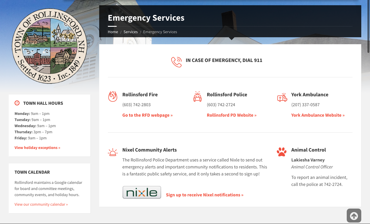
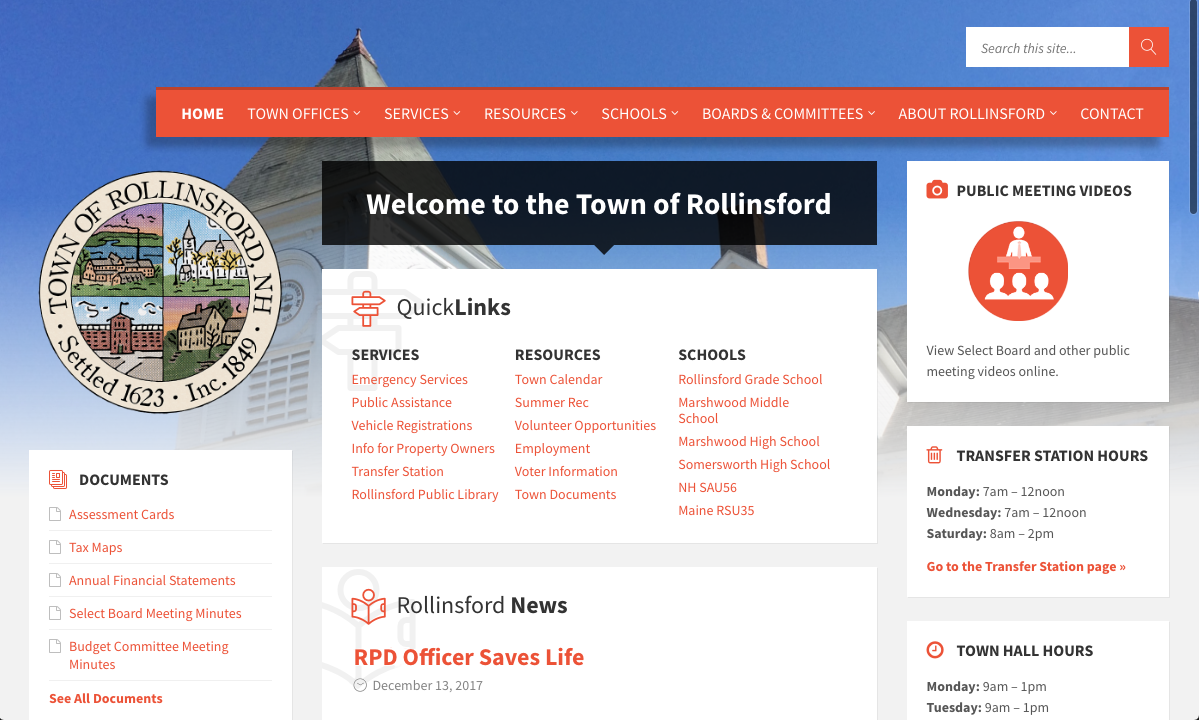
I worked with the town’s web administrator to create a new, modern website, organizing a large volume of information, adding a great deal of useful information for residents, and focusing on usability. The result was a fully functional municipal website – informational, organized, attractive, considerate, and user-friendly:
The completed website is maintained by the town’s admin and several years have passed, so the current site looks and functions a bit differently from when it was created.
If you’re considering a municipal website for your town, contact me and I’ll be happy to meet with you, your City Council or Select Board. I will work with you every step of the way, taking everyone’s needs into account while keeping the entire process organized. A well-designed and well-written website is the greatest information resource you can provide your town.
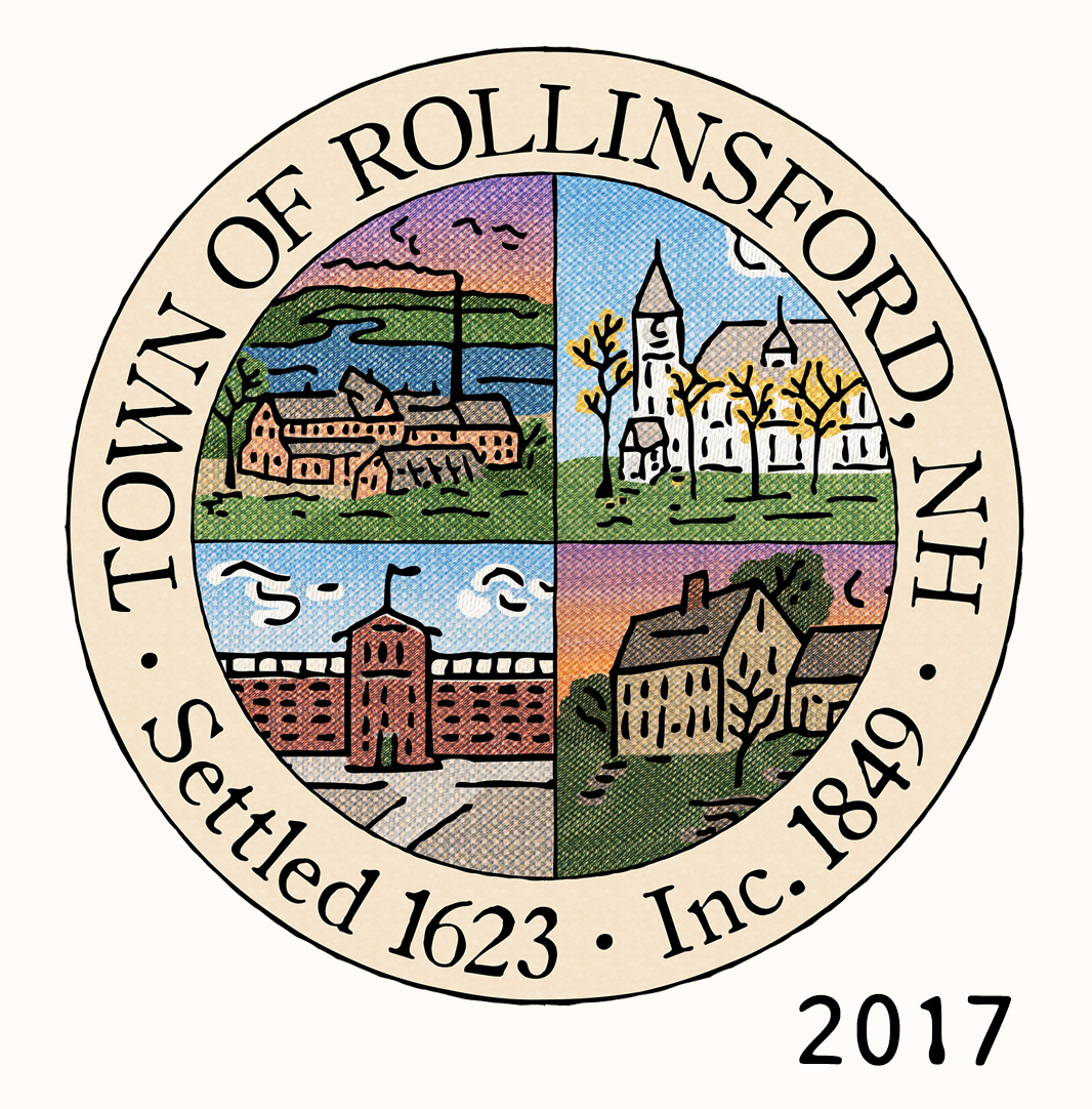
REDESIGNING THE TOWN SEAL
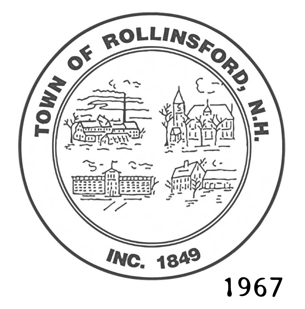
Every good design has a story! I always say this, and the Rollinsford Town Seal is a great example of how stories matter – and the value in preserving them.
The original town seal design was almost scrapped altogether, until I started to unearth the story behind it. In the end, I worked twice as hard to try and preserve the original design and to make sure that its story would not be forgotten.
View the town seal booklet created for Rollinsford.
A STORY THAT WAS ALMOST LOST
When the town came to me, they only had a relatively low resolution version of their town seal, and they were looking to have it updated. Originally, many people thought the old design should be scrapped altogether. I could not find a single person who could identify all four landmarks with any certainty, and people generally didn’t care for the (seemingly) slipshod quality of the illustrations. At that point, I was planning on creating a brand new, woodblock-style design of a natural landmark in town.
That said, I still wanted to get to the bottom of the old design, and for the next few months I learned about the original seal, how it came to be, the identity of each landmark, and the history behind them. It turned out that the original emblem was presented to the town on a flag – the design had been hand stitched by the women of the American Legion Auxiliary. (That’s why it looked like a rough sketch! The marks were stitches!) The more I learned about the original emblem, the more I knew that we didn’t need to discard this design, we needed to preserve it!
So I set out to do everything I could to enhance the original design of the town seal. I brought the images forward so they would be easier to see. I changed the typeface to an old style font with a hand-forged feel (as a nod to one of the landmarks – a foundry – and to Rollinsford’s industrial roots) and, in the color version, I created a pattern to give the look of a hand stitched textile (in honor of the original emblem and as a nod to Rollinsford’s textile history).
I also collected all of information that I had gathered when researching the emblem and its landmarks, and I created a booklet for the town so they can always know the stories behind their seal.