rebranding, logo development
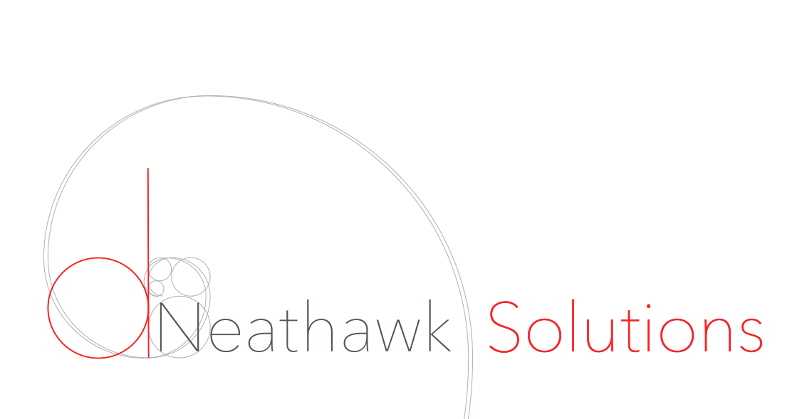
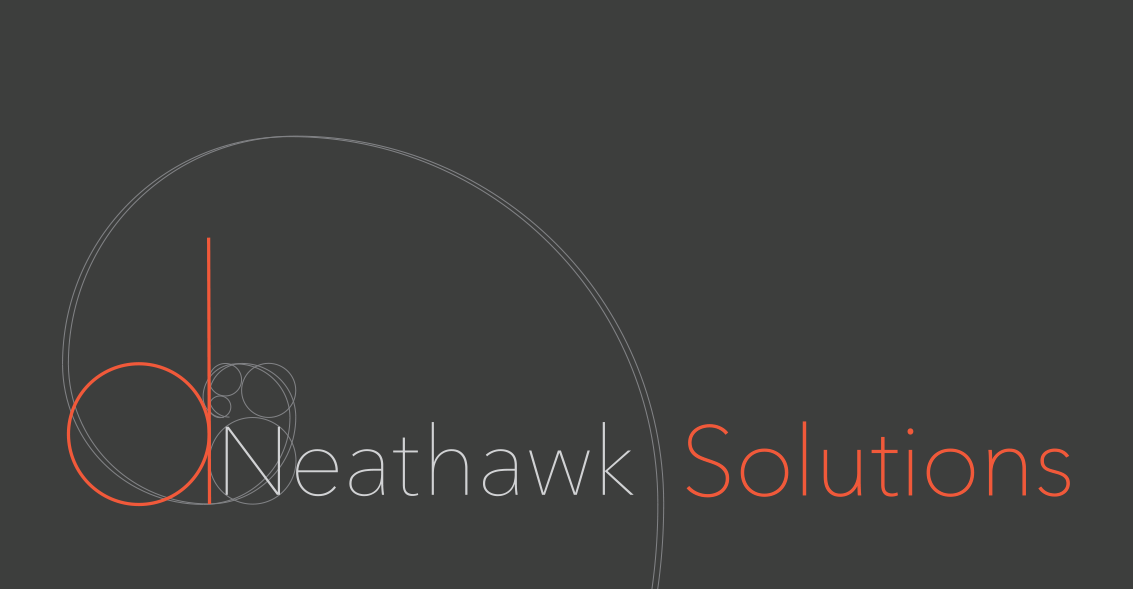
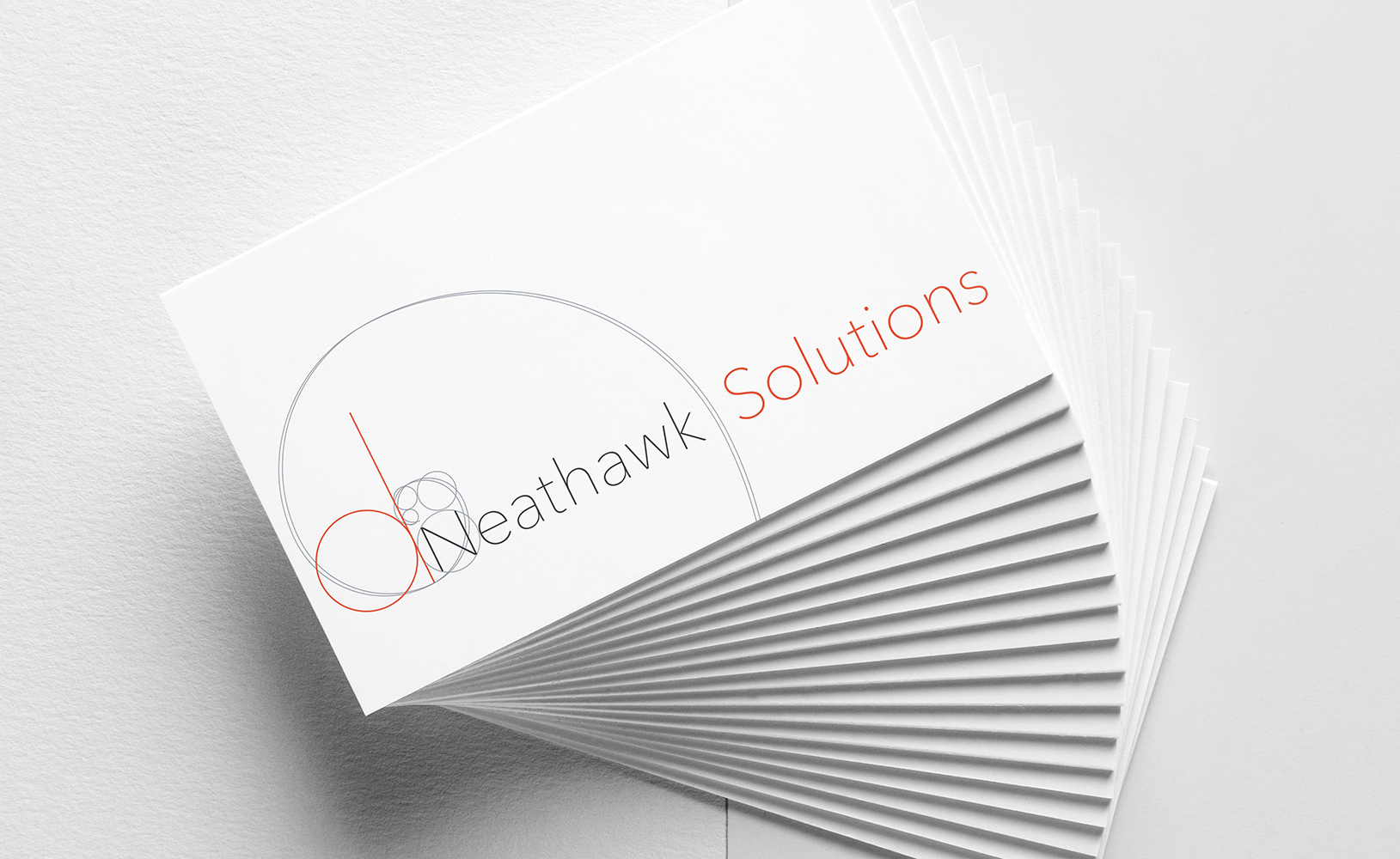
I worked with d.Neathawk Solutions to create an entirely new logo with a modern color palette to reflect their expansion into custom software and tech services.
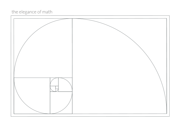
Conceptually, I wanted to create a design that reflects the elegance of math in nature. There are also several layers of meaning behind the design, including the five concentric circles built on the golden rectangle (representing the five members of the Neathawk family, as this is a family company).
On a personal note, this design holds a very special place in my heart. My dad taught me about the Fibonacci Sequence when I was a little girl. The Golden Ratio was still an obscure concept back then (it is much more prevalent today), so it was like we held the secret to the universe.
It has the extra something that I highly doubt anyone else would have pulled out of us. You listened… really listened and nailed it.
Dee Neathawk, Owner